One click too many
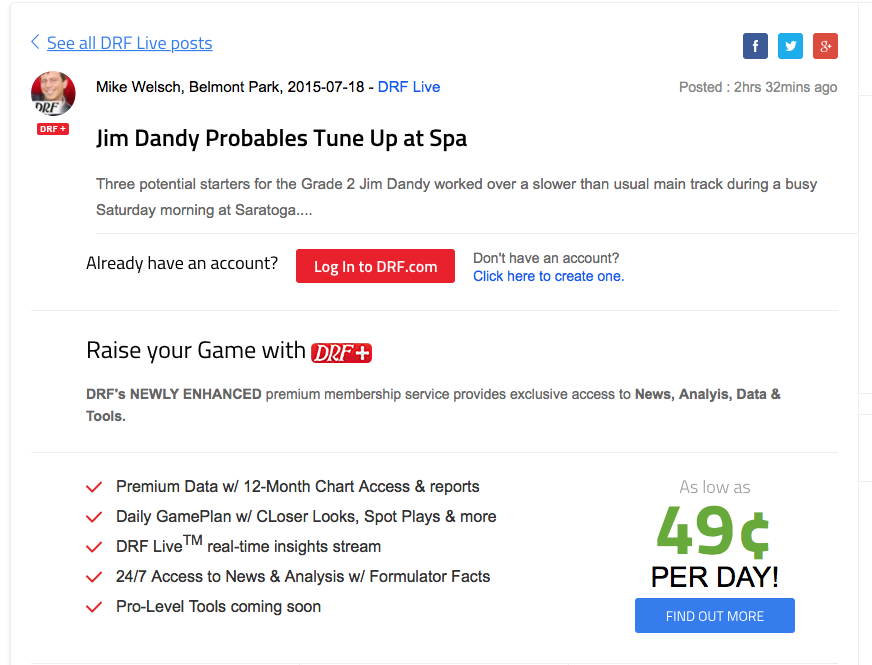
Much grumbling has been made since the Daily Racing Form put most of the newish DRF Live section behind their paywall. And it exacerbates an existing issue – that there are too many clicks if you’re not already logged in.
Let’s say you saw a tweet that linked to a DRF Live post, or just a regular old DRF news item, that was behind the paywall. And let’s say you wanted to visit that link. Unless you visit DRF frequently, as no doubt some of you do, you’re very likely to not already be logged it. Here’s how it plays out:
“Oh hey, I’d like to read that! Let me click the link…”
“Wait, I have to click another link to login? Eh…” (closes window)
In a related Twitter conversation with Jessica Chapel of Railbird, she summed up the situation perfectly…
That bit of friction — daily login, repeated browser login, in-app logins — forces your users to ask each time, is this content worth it?
— Jessica Chapel (@railbird) July 4, 2015
And in most cases my answer is “no.”
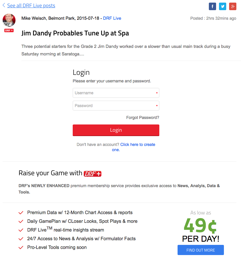
While I don’t know the implementation particulars, in general it’s a pretty easy problem to solve. And, it’s widely used interaction pattern. If you’re on Amazon and you want to view your cart, you’re given a log-in screen, not a screen that says “you have to log-in” that makes you click to another screen with the log-in form. Why not put the log-in form right on the landing page?
Implementation concerns aside (meaning it might require a decent amount of development work), a fairly straight-forward change like this might make the paywall pill easier to swallow. And who knows, they might already be working on something this or at least have it on the radar. They do seem to be making incremental changes with some frequency.
I like the overall direction of DRF’s visual design, but as a customer I’d love to see them raise their user experience game, so to speak.

